Monday, September 28, 2009

Multiple Representation Project

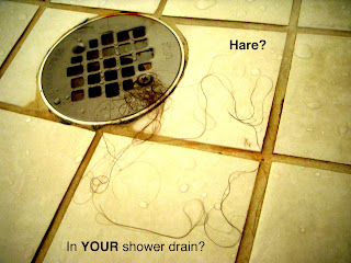
I really enjoyed this project. I have always wanted to do something like that but never really got around to doing it. It seems to be easier to do things like that when they are required. I took tons of pictures of different textures. I thought a lot about what kind of environments I could put my logo in to make an ironic or metaphoric statement. Some however I just thought about texture and positive/negative space. I actually own two rabbits at home so it was fun to incorporate that part of my life in this project. Out of my final images, I have several favorites. The first one being the hair in the shower drain. It is nasty. I normally would shy away from representing a rabbit in this way but I feel as an add is is fairly strong. It is nasty and therefore catches peoples attention and brings a stronger reaction. I feel like people would actually notice and pay attention to an add like this.

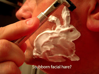
My other favorite is the shaving cream rabbit. Originally I had asked my dad if he would not shave for a few days so I could shave my image into his face. But he was unable to grow a good amount of facial hair in the amount of time I had in which to do the project. Instead I decided to use shaving cream. After executing this idea, I feel that this way of representing my idea was more effective than I had expected my original idea to be.
A fun idea I had not necessarily related to this particular project would be to choose one environment (i.e. one household inside and out) in which to repeat a
n image. Then keep record of where you repeated it and ask someone to try to find all of them, somewhat like a real life I SPY.

Thursday, September 10, 2009

Final Inked Logo Design


I have learned with this project that when Mr. Babcock says something he's serious. As I was finishing inking my logo design, I was catching a drip of ink on the neck of the bottle. In doing so I splattered ink on the white negative space around my logo. So...I had to start all over. I also learned that a rounded tip for a dip pen works better on illustration board as it does not tear the surface as badly. Honestly I feel as if I could have done better on this project. I don't feel very impressed with myself at this point. Which brings me to another point. I feel very uncomfortable with my skills with the Adobe creative software. I'm hoping that involving myself in AIGA and HI-RES Magazine will help to alleviate this problem. I believe that self confidence in the field of graphic design is vital. So heres to challenging myself and forcing myself to learn.

Sunday, August 30, 2009

Story Graphics Process

In the past i have used very little of the ideas presented by Prof. Babcock about Story Graphics. I have used brain storming techniques, but certainly not to the extent to which we are practicing them in class. However this does not mean that they are foreign ideas to me or that I don't find them helpful. I have actually enjoyed trying this process and really in the context in which Mr. Babcock presented it, it makes perfect sense for our field of study. Heres a little about my understanding of the process from my own experience and interpretation.

Subject Text List-Making lists is something I am very good at. I tend to function better on having a schedule and keeping track of my thoughts. So...even though I haven't necessarily used this tool in my design process, I find it very easy to adapt to. Making a list of ideas helps to give someone a bank from which to take certain ideas even further. It also helps to eliminate ideas that don't contribute greatly to a designers overall purpose.

Signifier Text List- This step is the one I have the most personal experience with. I used this concept for projects in both Drawing I and Design I. It is helpful for taking themes from the previous step to the next level in the design process. It is also the step in which ideas are mentally connected with objects or other ideas to represent them visually in the next step.

Image Thumnails-Mmmm Hmmm. I have lots of experience with thumbnail sketches. Initially when I was younger I would draw thumbnail sketches of ideas in my church bulletins. In high school, we were required to draw lots of thumbnail sketches before beginning projects. Then In college I was able to realize the importance of thumbnail sketches to rule out bad ideas and highlight good ones. Also I now see the value of having used thumbnail sketches from an early age.

Scan for Opportunities- At this point, while looking at an accumulation of sketches, I would personally be drawn to objects that would make sense together, as I tend to be a realistic person (not always :)) However, I see how it might be a good idea for me to get out of that habit to allow for surprising opportunities for design experience. At the same time, I might also choose to do more with objects or ideas that I am more personally attached to. This might be a habit I need to work on.

Redraw as Combinations- This step is new to me, and I have no real experience with taking random objects and finding a way to put them together. Usually I have preconcieved ideas of what object would work the best together. However, so far I have had fun trying this idea out and thinking about how to simplify combined objects down to make them more effective.

Gestalt Theory

Gestalt theory was introduced to me by Prof. Chris Lowrance last year In design I. He used the illustration of a persons perception of two dots and an arch or even just a longer line, as a face. While this is a good illustration for understanding a small portion (emergence) or a very general understanding of Gestalt theory, there is much more to be said about the Subject. Mr. Lowrance In drawing I assigned us a drawing in which we only drew negative shapes, another in which we only drew corners, and another in which we drew corners and small portions of outlines. All of these now ring in my mind as reification and the Pragnanz law of closure. Other perceptions of visual markings exist but these few examples help me understand the concepts. It also helps me put vocabulary to my own experiences with visual perception of forms. A personal example would be seeing animals or objects in the clouds as they drift by or in textured walls. Sometimes when looking at wall paper with high contrast, optical illusion will push some shapes back and bring some forward confusing positive and negative forms. These are a few of my basic thoughts on the subject.

Saturday, August 22, 2009

Courses for the future

Next semester I will be a second semester Sophomore, but technically have enough hours to be starting my first semester as a Junior. I would really like to graduate early if at all possible, but am told this will not be a possibility. None the less, here are my plans.

Spring 2010 (sophomore)
I plan on taking Art 2710 Intro to printmaking, Art 3620 Logo/Trademark design, Art 2420 sculpture, and Art 3510 watercolor, and Art 4860 Contemporary Art and design.

Fall 2010 (junior)
I plan on taking Art 3630 Design for Advertising, Art 4610 Motion Graphics, Art 3660 Publication design and Grap 2030 Digital pre press for printing, and

Spring 2011 (junior)
I plan on taking , Art 3640 Package design, and Interactive design and possibly Comm 3640 Mass media advertising.

Fall 2011(senior last semester :) hopefully)
I plan on taking Art 4620 motion design, Phot 1210 and 1211 Foundations of Professional Photography and Lab, Art 4020 Studio seminar, and last but not least ICap 4221 Artists in Contemporary society.

*Please Note* This is not a solid plan and is subject to change as summer classes become available.

Semiotics

A lot of times I find out as I go along that I didn't understand a concept as well as I initially thought, but here is what I am fairly certain I understand about semiotics. Its something I won't understand fully if at all until I have put it to practice, but it seems to have a lot to do with the relationships between things or ideas, and the symbols that represent them. I also understand that it has a lot to do with my future, and my work as a graphic designer and is something I will need to improve upon greatly if I ever intend to do anything worthy of being noticed. I am a very detail oriented person, but I also think pretty literally. I think possibly both these qualities can either help or hinder me in my improvement of understanding semiotics. Although, I have noticed myself starting to think about these types of things just in the past few days. Mr. Babcock talked about focusing on shapes not lines. And while watching my boyfriend pack to leave for college, I noticed his Swiss Army duffel bag. On the outside on one end there was a pouch, attached but completely separate from the rest of the bag it had the Swiss Army cross logo in the center, and on either side of the cross there were three shapes put together. An ellipse attached to a longer narrower ellipse, which was attached to a squiggly line. In our society anyone would immediately recognize this composition of shapes as a pair of ear buds. Almost a symbol in itself of our current society. So just from the appearance of the ear buds I immediately knew the pouch was to be used for a portable music storage device. Semiotics :) So basically instead of a detailed image of gradients and shading and details, the simple three shapes are just as affective if not more so. I will post a picture of this image later as I have access.

Wednesday, August 19, 2009

Test Post

This is a test post.